I am copying a section of Botticelli’s Primavera, from the far right-hand side of the painting. The description accompanying the picture in the Uffizi Gallery says that it shows the nymph of nature, Chloris, turning towards Zephyrus, the Spring wind, who is pursuing her. I am one of many in the school attempting to copy Botticelli’s delicate colouring and line. For someone taught in a British art school, where my own ideas, rather than technical mastery, were paramount, the process has been at times frustrating, but mostly it has been a lesson in enjoying the journey. I am trying to learn from the process of copying a masterpiece rather than focusing on the end result of what I actually produce, which will be, at very best, half finished by the end of next week.
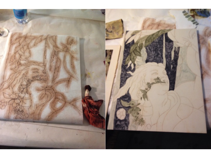
The first day started with drawing, measuring the relative proportions to recreate the composition. I could have traced the picture, but chose to do things the harder way so I could get the exact section I wanted. Right from that first day I knew that my picture won’t be an accurate copy, some of the relationships are wrong when comparing my drawing to a photograph of the original. Then came punching small holes along the lines of the drawing so that I could transfer it on to my panel once prepared.
This next stage, though, did not go so well. Preparing panels in winter, with limited time, is not such a great idea. The first five coats of gesso and rabbit skin glue I put on during the third day had not dried overnight, and when put in front of a heater they dried unevenly. Another couple of coats to cover the patches worked, after a further 24 hours drying time, and on Friday I spent the first two hours of my day sanding the surface to smooth it down.
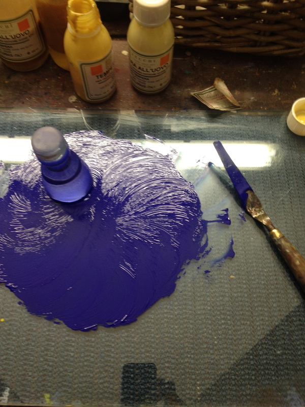
In between I have mixed colours. I have to admit that I am a little disappointed the school uses a ready-made egg tempera medium. However, it is much more practical than going through the ritual of extracting egg yolk from the its sac, so perhaps this is another example of where I try to do things a harder way than it needs to be. I ground six basic colours into the tempera mix, and from these have mixed different shades and tones according to the picture, matching them up with the colours reproduced on the photograph of the work I am using.
 RSS Feed
